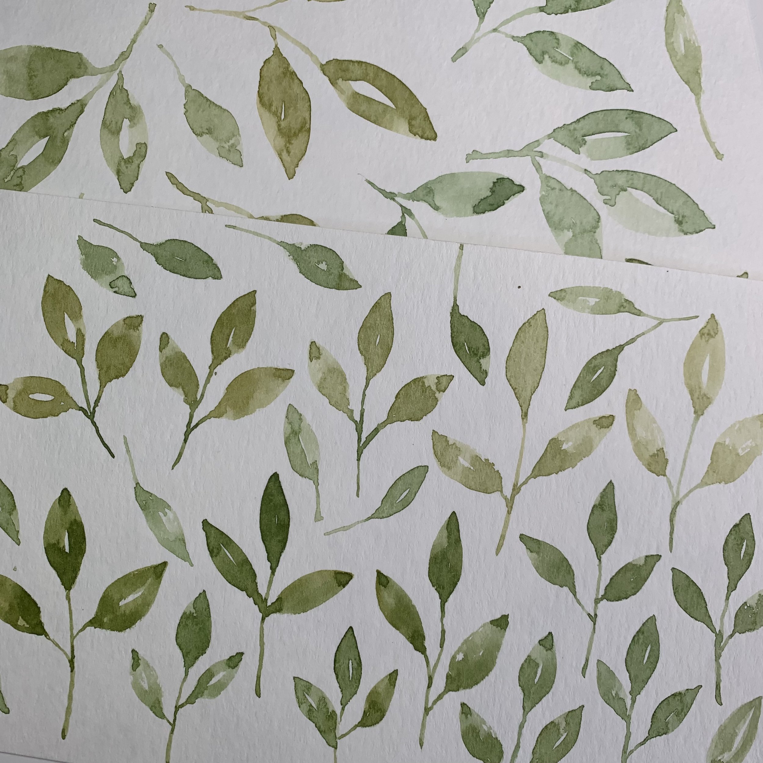
Struggling with watercolor motifs?


Tips for creating watercolor motifs SIGN UP:

Weird blooms, color that becomes flat and solid, wonky edges, there are so many things that can go wrong with watercolor. Learning a few simple techniques can really make a difference.

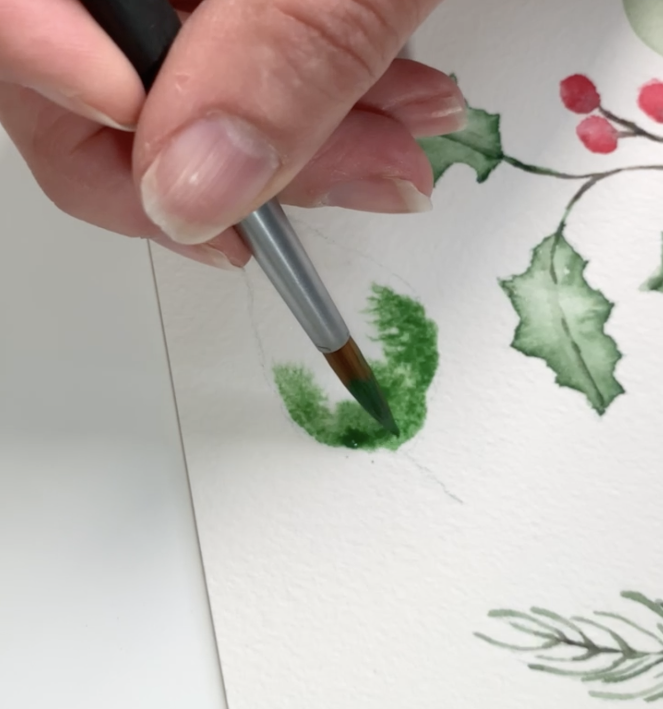
I am an eternal student of watercolor painting. I don’t foresee becoming a master painter but I adore the process of painting, the sound of the water swirling in the jar, the feel of the paint on the brush, seeing the pigment move across the page as it flows into the water. It’s magical :)

Sometimes, I struggle to achieve whats in my minds eye but I have developed techniques that let me take my wonky paintings and turn them into beautiful patterns.

I’ve created a short list of 5 tips that I use to paint and prepare my art for use in repeat patterns. Give these tips a try to see improvement in your watercolor pattern design.

Let me know in the comments what you think and if the information helps you. If you have a friend who would benefit from these tips, please share the link so they can sign up too. Creating a community to share knowledge, techniques, and feedback will make us all better painters and designers.


 

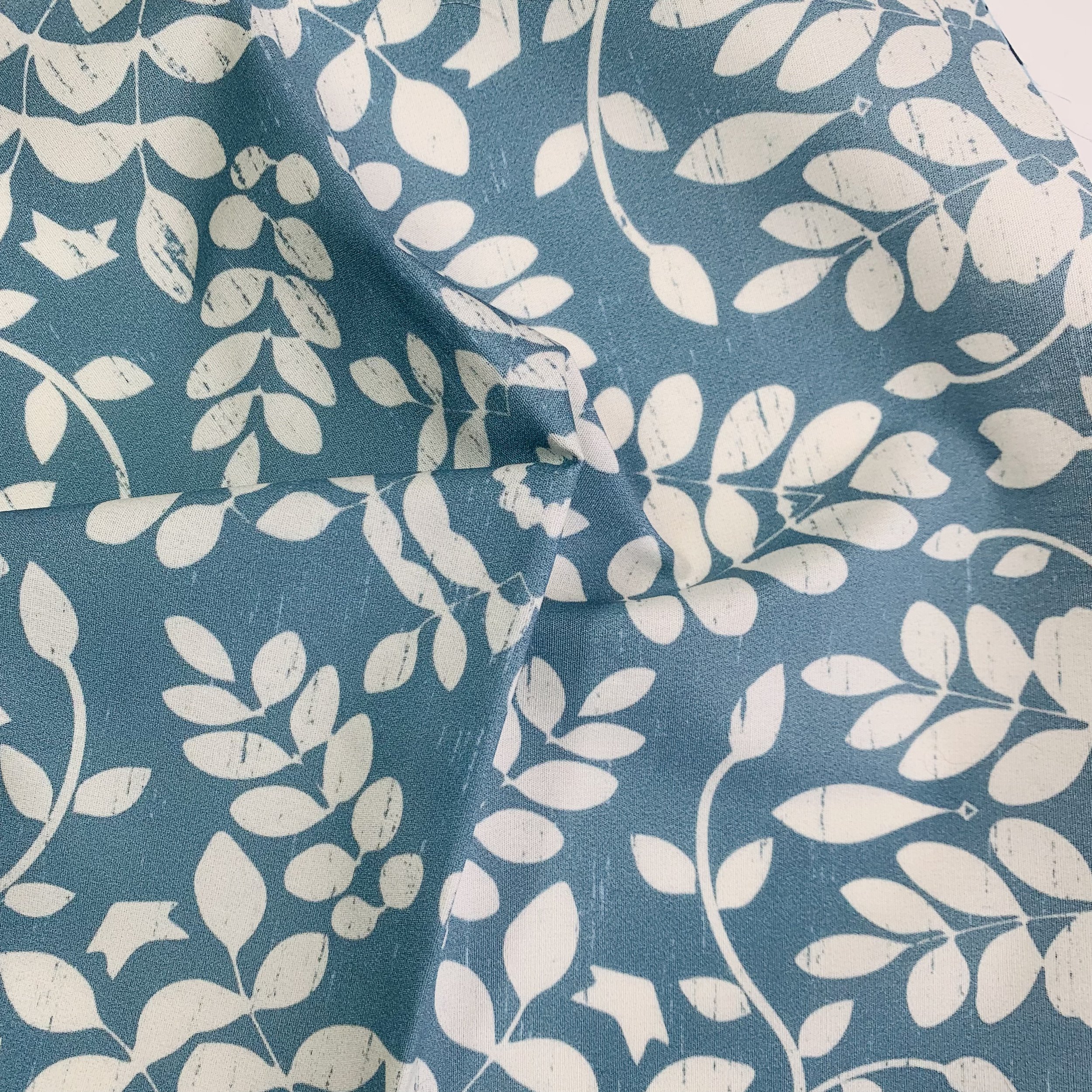
Pattern Development - Leaf Damask


Highlighting my Leaf Damask pattern today.

Sometimes a painting changes quite a bit so that it is barely recognized. I create a lot of tossed repeat designs for my main designs but I love a more structured repeat for a blender.

See my plaid tutorial as an example of a great structured pattern.

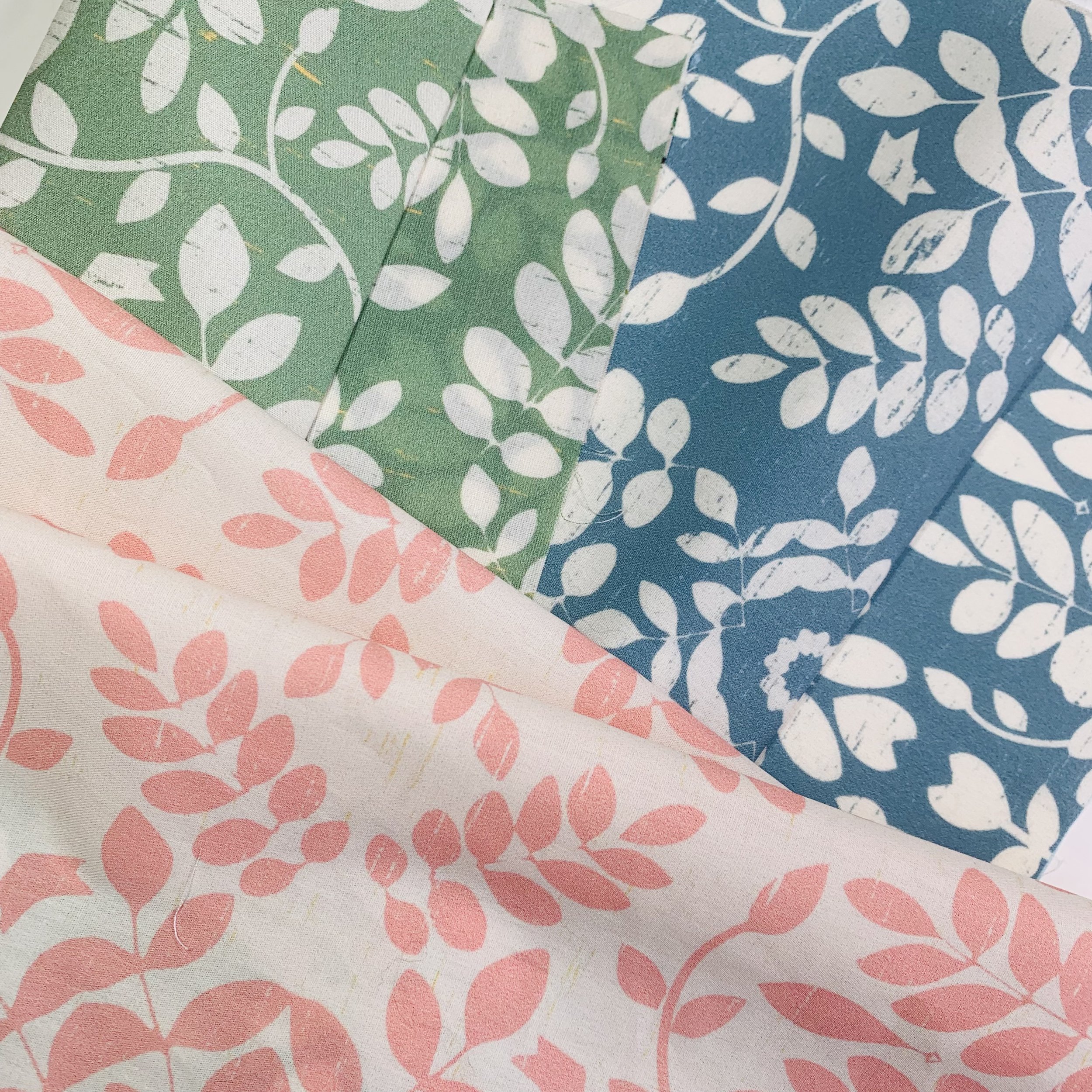
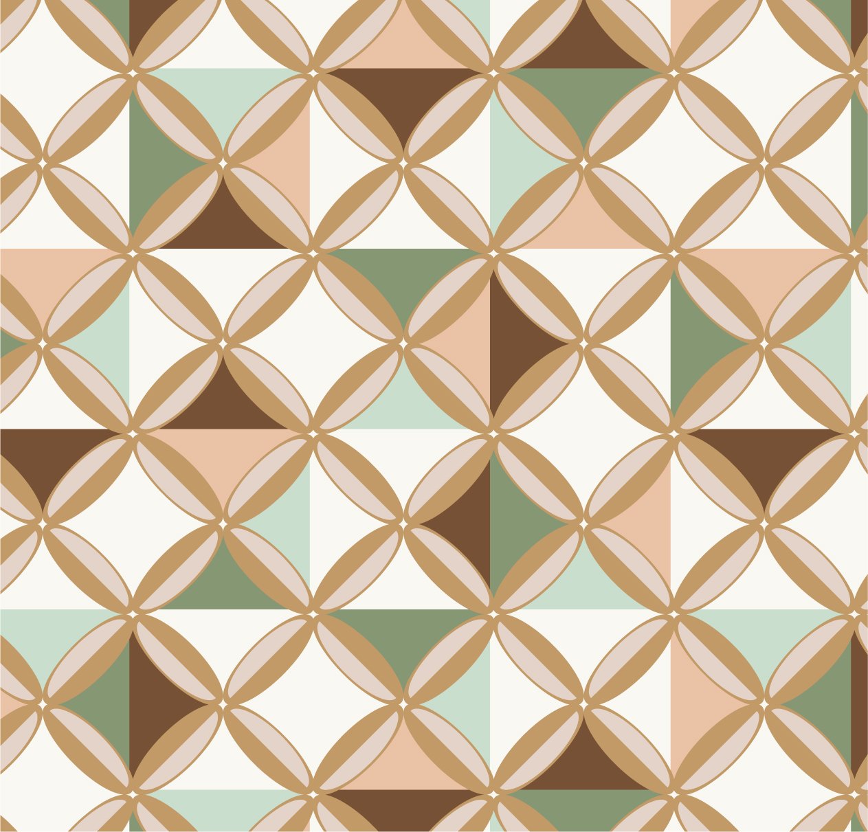
Leaf Damask is a mirrored -almost a mandala- repeat layout. It incorporates a linen texture overlay in a contrasting color. I am partial to textural effects!

I have 5 colors of this pattern in Spoonflower and it is my most popular pattern so far.

This pattern is truly universal and could be used on so many end-uses. What end-use would you use it for? Kitchen textiles, wallpaper, outdoor furniture, notebooks?


Check out my Spoonflower shop for fabric and wallpaper HERE. Enjoy!


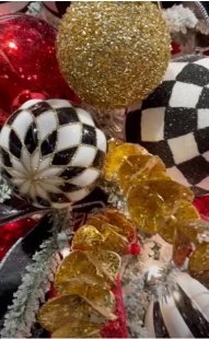
It's beginning to look a lot like...


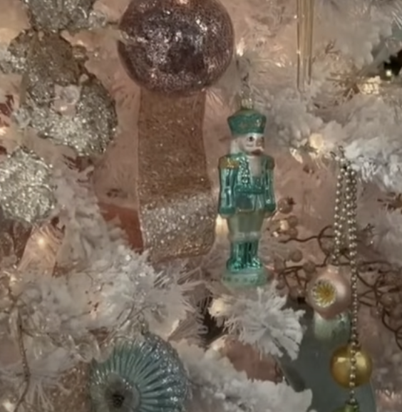
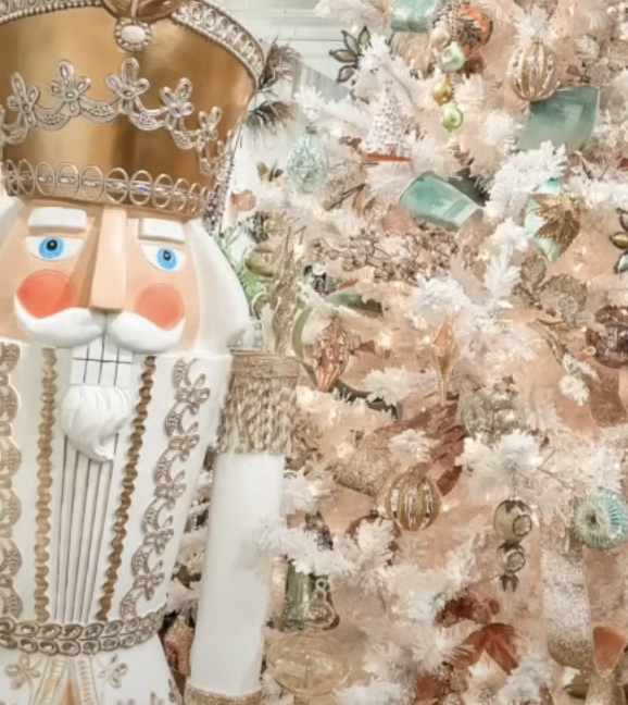
2024 Holiday palettes are here! Download the Holiday .ASE color swatch files BELOW to use in your holiday designs from now through the winter season.

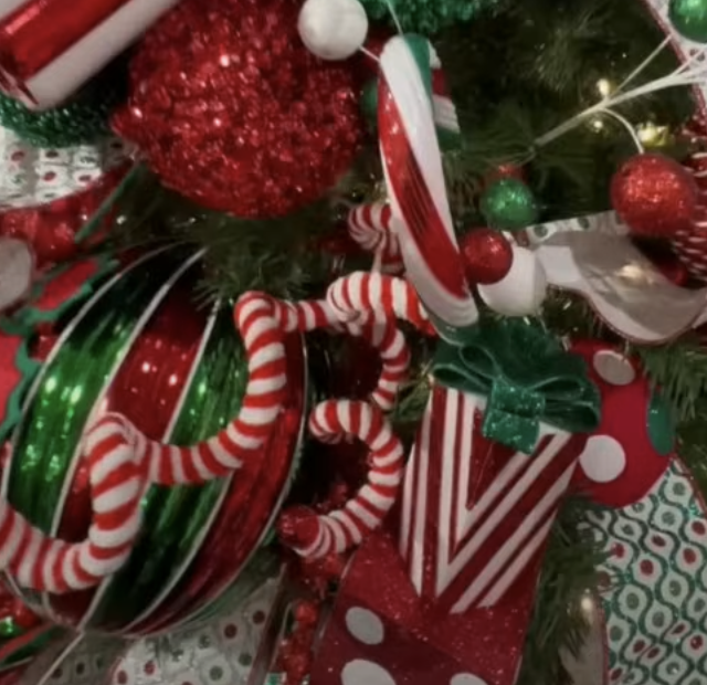
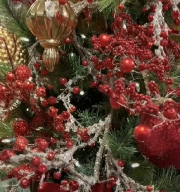
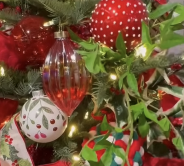
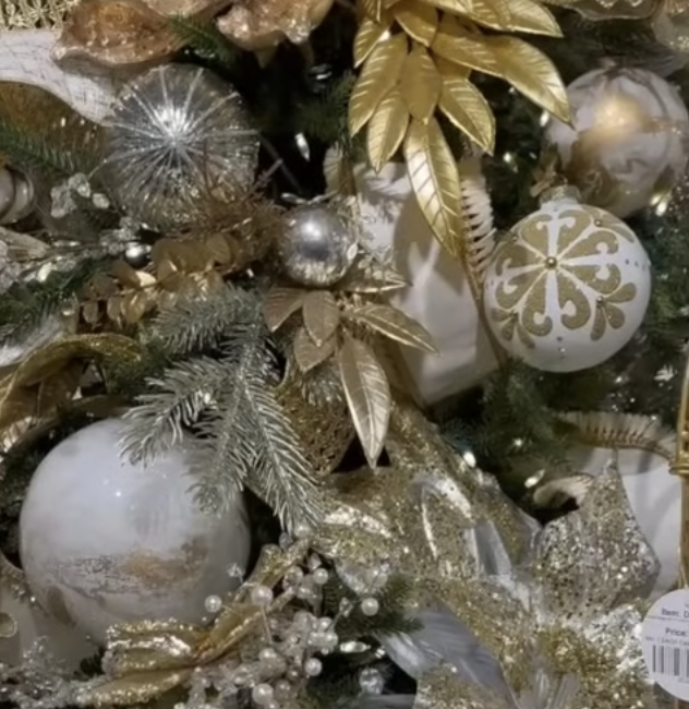
I’ve been researching seasonal colors and would love to share them with you. There are 7 color themes for 2024. Some palettes are very focused and some have a broader range. All incorporate metallics to some degree. In surface design, metallics can be simulated through the use of silver greys and warm golds. All together the color themes make up a timeless, cheerful palette that has the traditional colors we love along with some sparkle and shine and colors that make the holidays accessible to all tastes and styles.

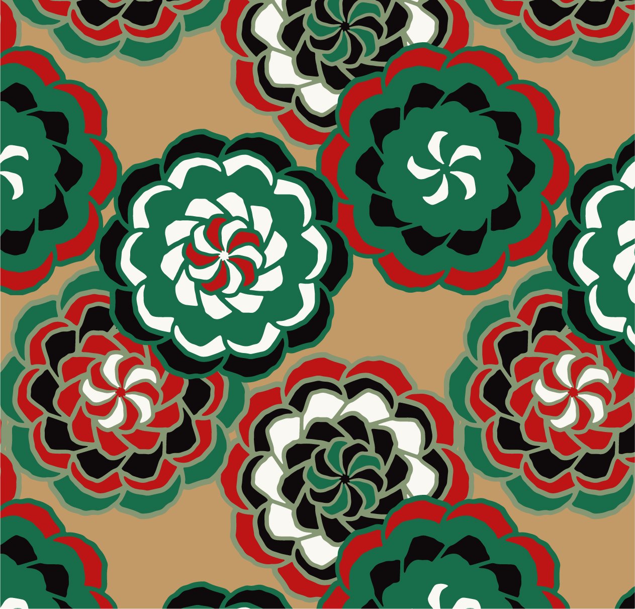
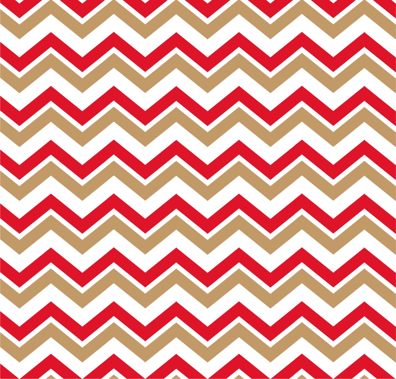
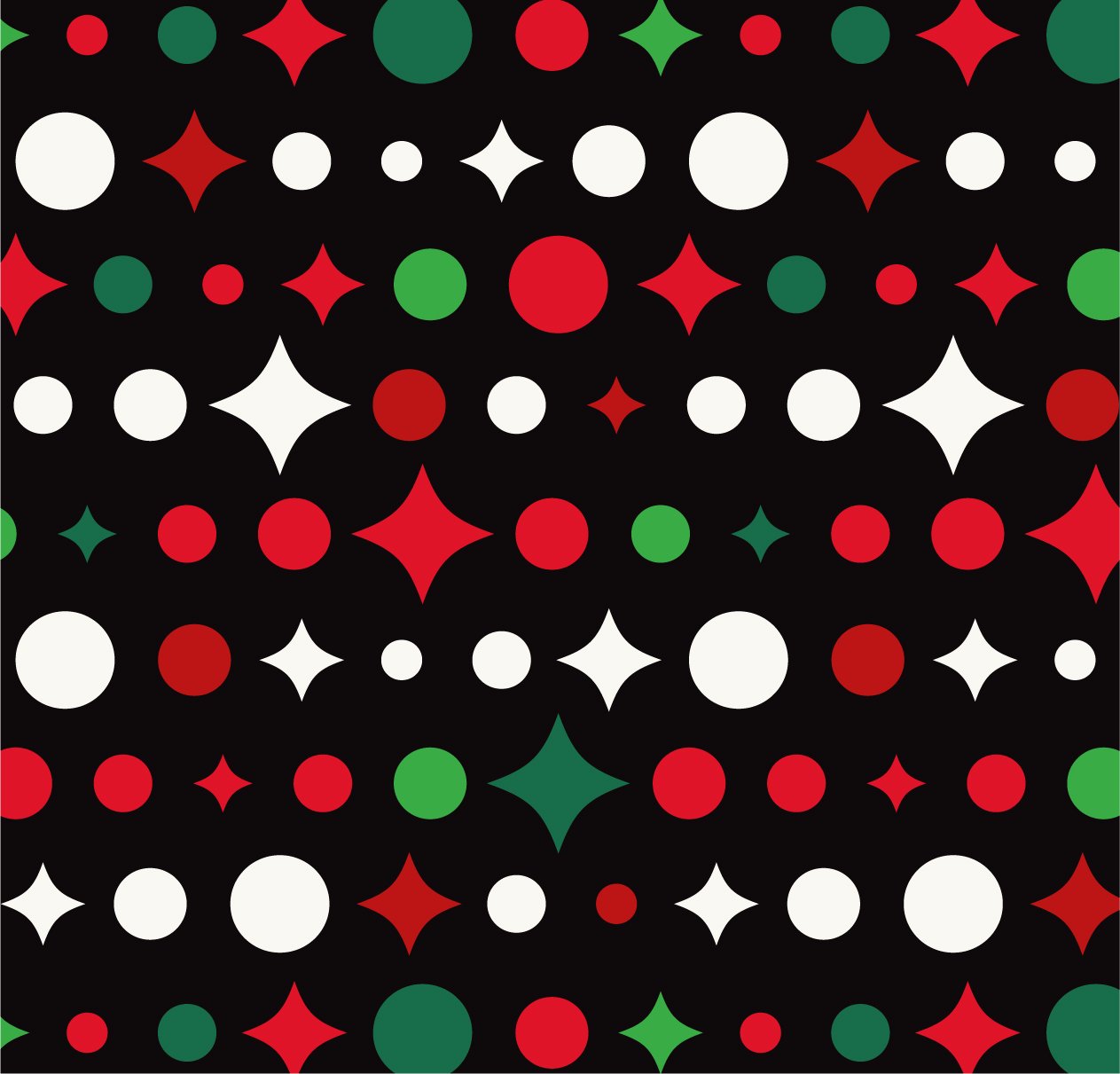
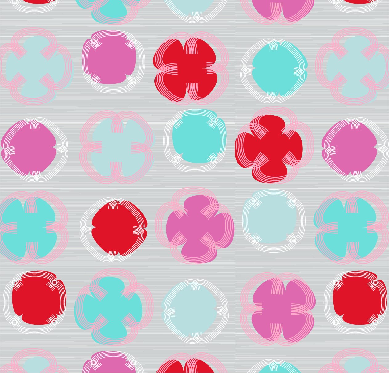
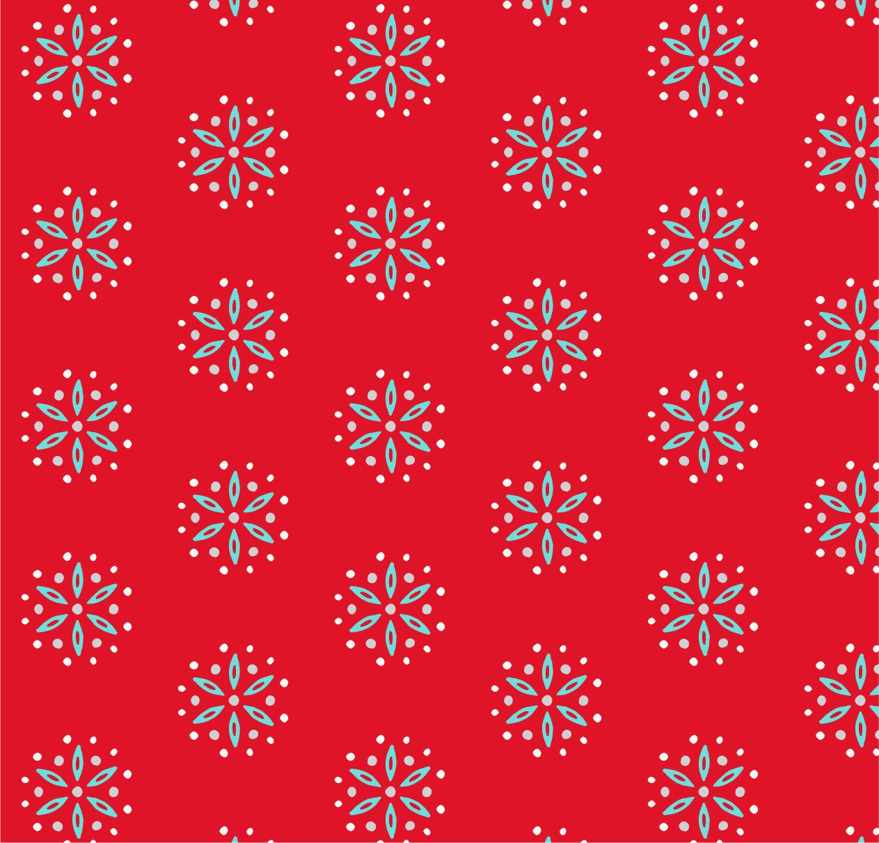
I’ve included some of my own favorite geometric patterns to show how the colors can be used.


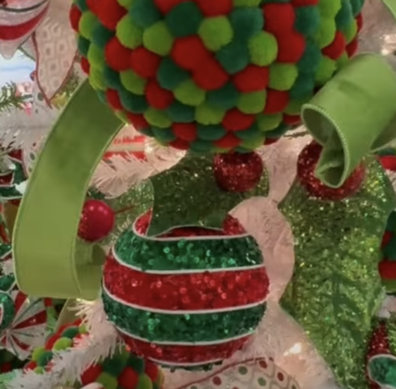
Three palettes incorporate traditional themes. Cozy Home, Glamour, and Candy Cane Brights focus on varying degrees of red, gold, green, white, and black. The newest color focus is on the saturated yellowy green to brighten the traditional palette.


Two more palettes also use bright non-traditional colors. Look for Traditional Twist, and Vivid Pastel palettes in the download. The aqua blue and aqua green along with red, white and silver are important combinations to note.


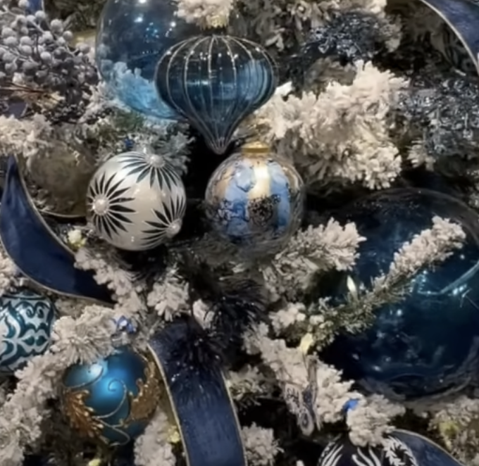
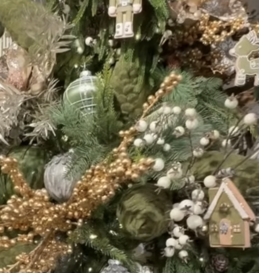
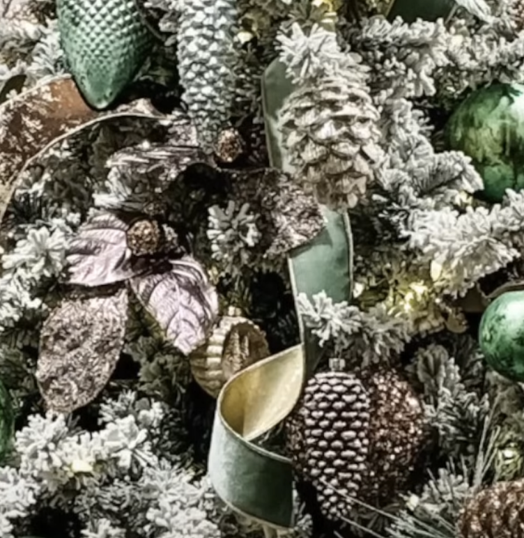
The two remaining palettes include Forever Blue, the blue white combination that has universal appeal, and Botanical, a natural palette of softer tones. This one incorporates the an important brown-gold tone like a dark bronze, along with the gold and silver that delineate the holidays from every other season.


Download all the palettes HERE.

Let me know how you will use the colors. If you post images using these palettes tag me @janethilddesign so I can share your beautiful work in my stories.