Pattern Development - Garden Yellows


Mid August is a busy time in our household. You may be feeling the same if you are a teacher and/or have children. With only a little time to paint this week, I pulled out a square repeat of 5 petal flowers that I had sketched out earlier this summer..

This post shows my process of going from painting to repeat. Follow along and let me know how you work through the messy middle of creating a repeat from watercolor artwork.

I painted a few flowers in a loose repeat. With time restrictions looming I did not follow through with all the details originally planned that you see in pencil. The flowers looked good alone so I went with them. I added a few flower centers along the side of the paper. I kept them separate in case I decide to vectorize the artwork later.


Scanning is always the first step. I opened the scan in Photoshop, removed the background, and began the process of eliminating the pencil marks. I was not careful to stay near the lines I had drawn. Sometimes pencil gives an elegant look to the watercolor. Here though, the lines didn’t make sense. I removed them and brightened the color overall.

The next step was to test the repeat using Pattern Preview in Photoshop. The flower along the edges was not well matched and my attempt to fix it didn’t improve the situation. It was better to remove it entirely and put a modified copy of another flower there instead. Next I dropped in the flower centers. I like them small and the high contrast is great. The individual flower colors needed only small adjustments which I accomplished with blends and hue/saturation tools.

The repeat needed a little adjustment but it wasn’t too far off. I added a background color along with a faint textured ground. Done!


This pattern will soon be available on Spoonflower. Check out my shop HERE.

Do you struggle to work your watercolor paintings into pattern designs? Let me know in the comments if you are interested in tutorials showing any of the processes I went through.

Enjoy the rest of August!



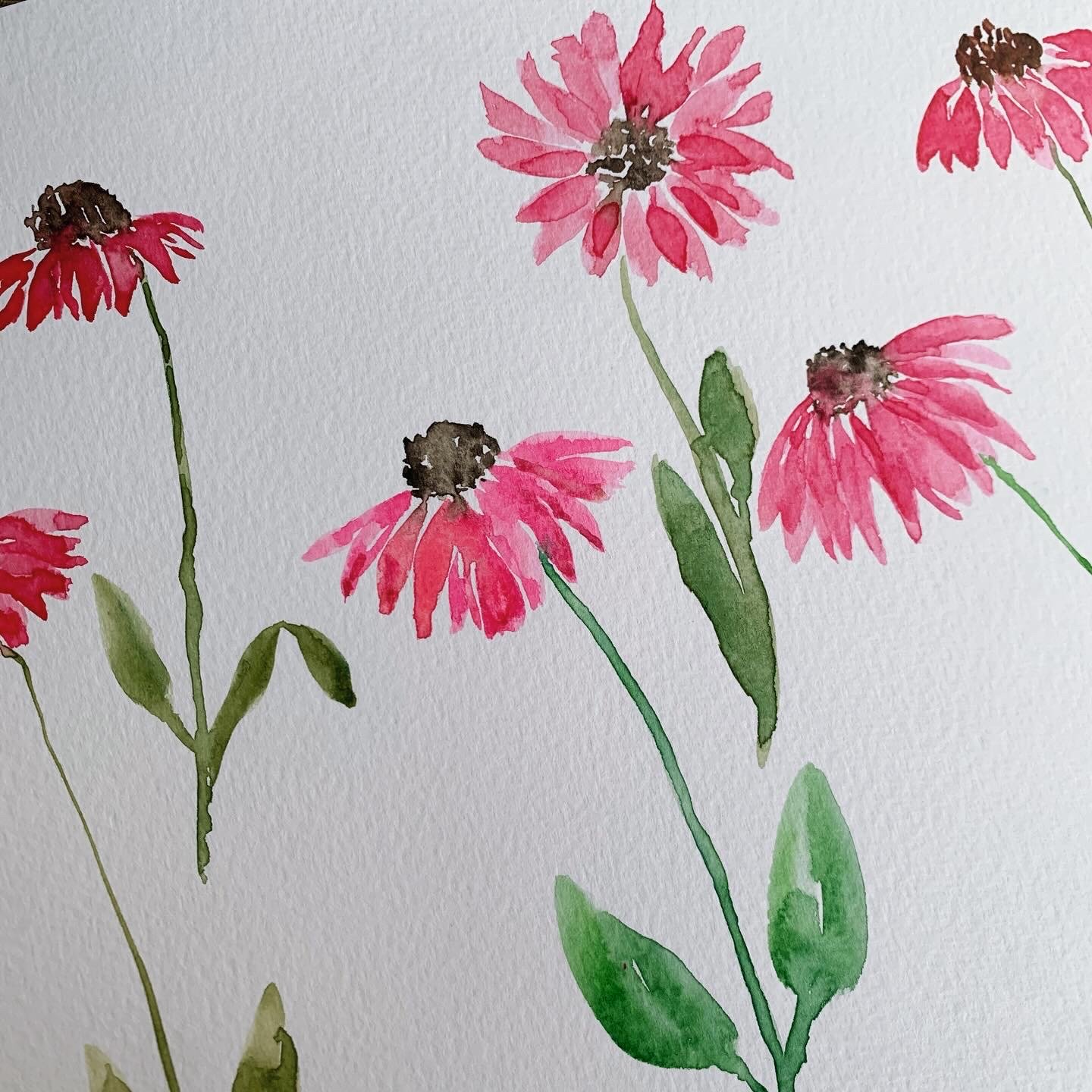
Flower Palette - Echinacea Purpura


also known as Purple Coneflowers, are one of those (many) flowers that amaze me with their vibrancy.

Coneflowers grow in many colors. We have these in an abundant display around the porch. Hummingbirds like these flowers, the color is hard to miss! Other birds too, and if left unpruned will give winter birds something to forage.

Echinacea symbolizes creating healthy boundaries, while Coneflowers are said to symbolize vitality, strength, and healing due to its ability to adapt to climate and soil diversity.

I painted this coneflower study awhile back and then created a pattern in Photoshop from them. Do you ever feel that your watercolor motifs are not good enough to use in designs? There are techniques that can improve the look of the painting. This pattern uses a color overlay to soften the tone and reduce the number of values.

This pattern is licensed with Natural Roots Fabrics. Find it here: Natural Roots - Janet Hild Design

I’ve created an .ASE color swatch palette from these photos for you to use in your designs. Import it to your favorite drawing program including Photoshop, Illustrator, Procreate, and Fresco.

I have recolored some of my artwork in Adobe Illustrator using this palette. It works really well in a variety of designs. Enjoy!!

If you use this palette and post the artwork, please tag me #janethilddesign. Share the blog post with anyone else who might enjoy it. Thanks!


The Grandmillenial trend is everywhere. Will it last?


Grandmillenial refers to the mixing of a vintage aesthetic with modern color and style. It's a surface pattern designer’s dream trend.

After an extended era of minimalist trends for interiors, the quarantine experience reminded everyone of the importance of our living spaces. A home that includes sentimental keepsakes, vibrant colors, and natural, biophilic design elements helps us feel more at ease and connected. Since then, wallpaper sales have surged as people look for easy ways to refresh their spaces.

(Image credit: Dina Bandman Interiors / Photography by Stephen Karlisch for Homes and Gardens) Not my design work.

This desire to create feel-good environments has sparked a renewed interest in nostalgic looks. Remember when antique furniture couldn’t be given away? Now, a deep appreciation for old craftsmanship has returned, bringing beauty and character back into our homes. This is where my work fits in, along with many other designers who adore florals, ticking stripes, and little ditzy prints. Creating these patterns is truly a joy.

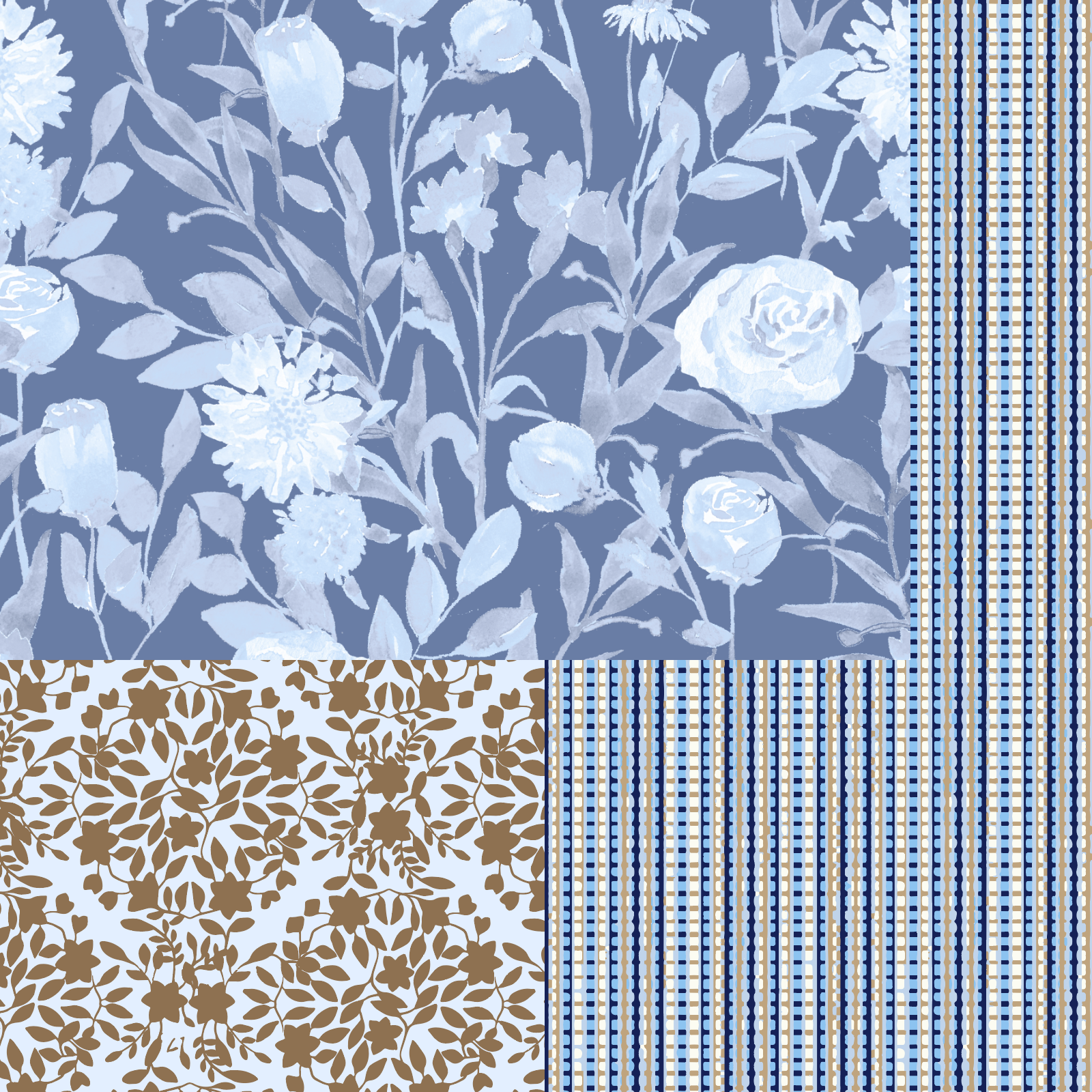
Three patterns perfect for the Grandmillenial style

Top: Roses + Blooms, Left: Garden Grows, Right: Terrain

This trend offers so many avenues, from bold patterns to intentionally faded colors. Everything blends together in a comfortable, cozy way. The charm of the Grandmillennial trend lies in its ability to merge the past and present, creating spaces that feel both familiar and fresh.

Sources say the trend will hang around awhile. I’m so glad! What do you think will come next in interior design trends? Share your thoughts and predictions!